Issue 09
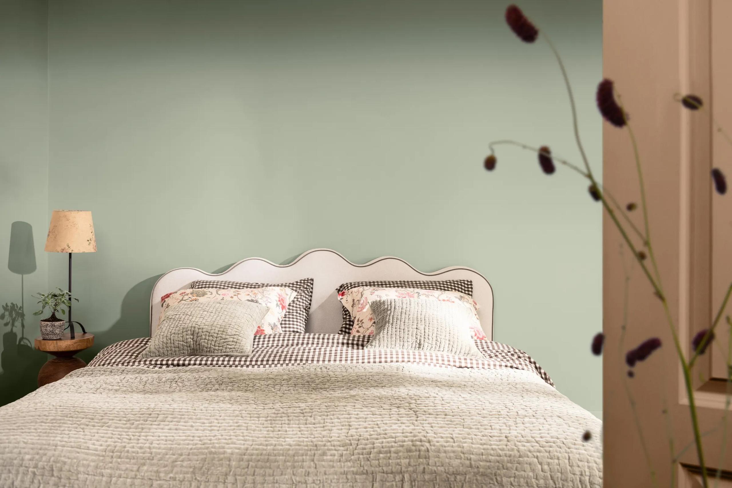
A bedroom styled for Nordsjö's colour of the year 2027 campaign, walls in AkzoNobel's Soulful Sage behind a scalloped headboard and gingham bedlinen. The softest green on this year's list, and the one I expect to look grey by November.Courtesy of Nordsjö / AkzoNobel
Every colour of the year 2027, judged by the room
14 October 2026 · Materials, colour & light · 7 min read · By Poppy Leverentz
Four paint giants picked green for 2027, two picked blue and the rest went to earth. Where each one works, where it fails, and the one worth specifying.
Four of the largest paint companies in the world looked at 2027 and saw green. Dulux chose a soft, silvery sage. Sherwin-Williams chose a pale green named after a vegetable. Behr chose an olive. Benjamin Moore, last of the four on 14 October, chose a deep green from its historical collection.
These are the companies whose tins end up in hotel corridors, dental clinics and rental flats. A colour of the year is less a forecast than a delivery schedule. Somebody will paint a lobby in one of these in March.
The reaction I keep returning to came from a morning show in Philadelphia. The hosts discussed Celery on air, shared the clip on TikTok, and the comments were quoted by Complex. "Hospital green," wrote one viewer. Another: "I painted my kitchen this color back in 2007. I guess it's on a 20 year cycle."
That comment is the problem with this year's list. Nearly every release this autumn leans on the same words: calm, nature, balance, grounded. Behr went as far as naming its colour Grounded. I don't doubt the research. I doubt that calm is a colour.
Here is every major colour of the year 2027 announced by 22 October, judged the way the people paying for rooms should judge it: where it works, where it fails, and where you can already see it. Pantone has not named its colour yet. Last year Cloud Dancer arrived on 4 December, so expect the 2027 pick in early December.
Soulful Sage and Celery, the waiting-room greens
AkzoNobel announced Soulful Sage on 8 September, for Dulux and its sister brands, and Nordsjö's Norwegian release followed two days later. AkzoNobel calls it an "ethereal, soft and silvery green". Heleen van Gent, creative director of its Global Aesthetic Center, framed the year as "lighter spaces for a lighter life."
It works best when it is a material rather than a paint. The best sage-adjacent room I have seen this year has no paint in it. In Seoul, the Tokyo studio I IN clad Nigo's Human Made store at Lotte Mall Jamsil in handmade Korean celadon tiles, pale green drifting to blue, each with its own crackle. "Rather than allowing colour to dominate the experience, we wanted texture to become the defining quality of the space," co-founder Hiromu Yuyama told Dezeen.
Where it fails is flat, on plasterboard, in a north-facing room in Stockholm between October and March. A silvery green with that little in it goes grey under a low sky and clinical under cool LED.
Sherwin-Williams announced Celery, SW 6421, on 15 September, co-selected with HGTV Home. The company describes it as "a soft, muted green with subtle yellow undertones" and lists offices, healthcare, hospitality and retail among its uses, down to terrazzo with green aggregate chips.
That yellow is what saves it in a south-facing breakfast room or a laundry with a warm bulb. It is also exactly what turns on you in a corridor lit from above, which is how the hospital comments got written.
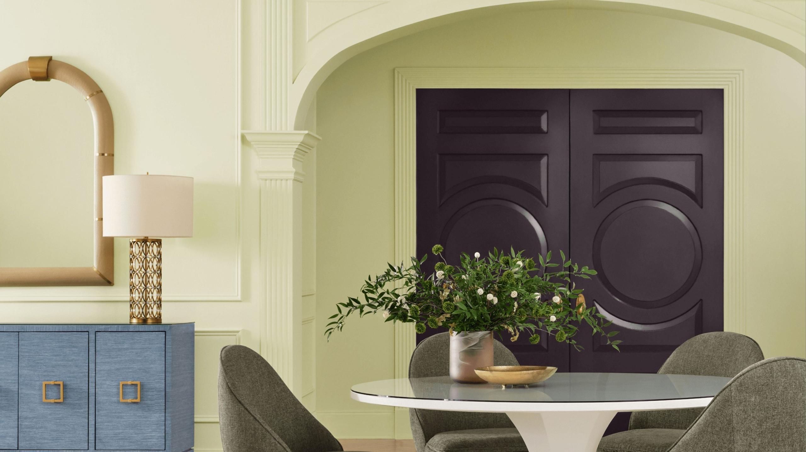
The real Celery rooms are on Sherwin-Williams' own page, posted by customers: a reading nook painted walls and ceiling by @athomewithashley, and the inside of a hen house by @houseandhens. Wellness, balance, connection. As briefs go, it suits a hen house well.
Grounded and Webster Green carry some weight
Behr announced Grounded, T27-01, in late August, the tenth colour of the year in its programme. Behr's own description is "a mossy olive with earthy brown undertones", and its Canadian page lists the light reflectance value at 11, on a scale where black is 0 and white is 100.
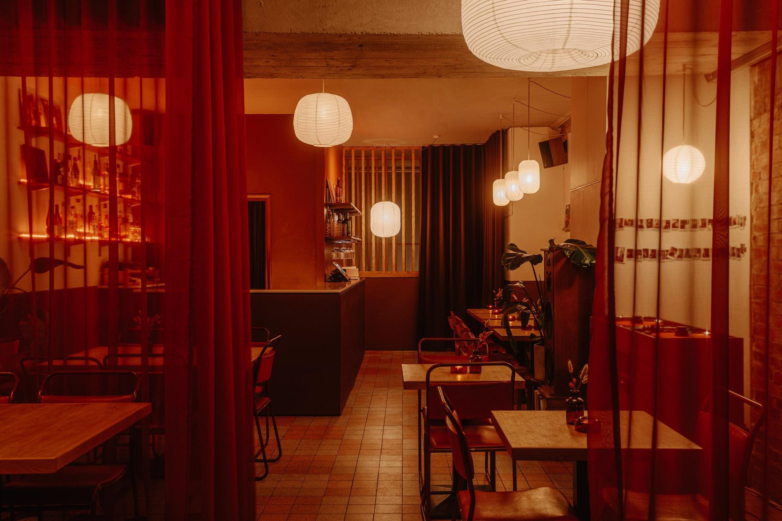
That number is the whole review. In a library, a bar or the wall behind a restaurant banquette, where the lamps are low and the evening is the point, Grounded will look expensive. In a small office with one window it will eat the room.
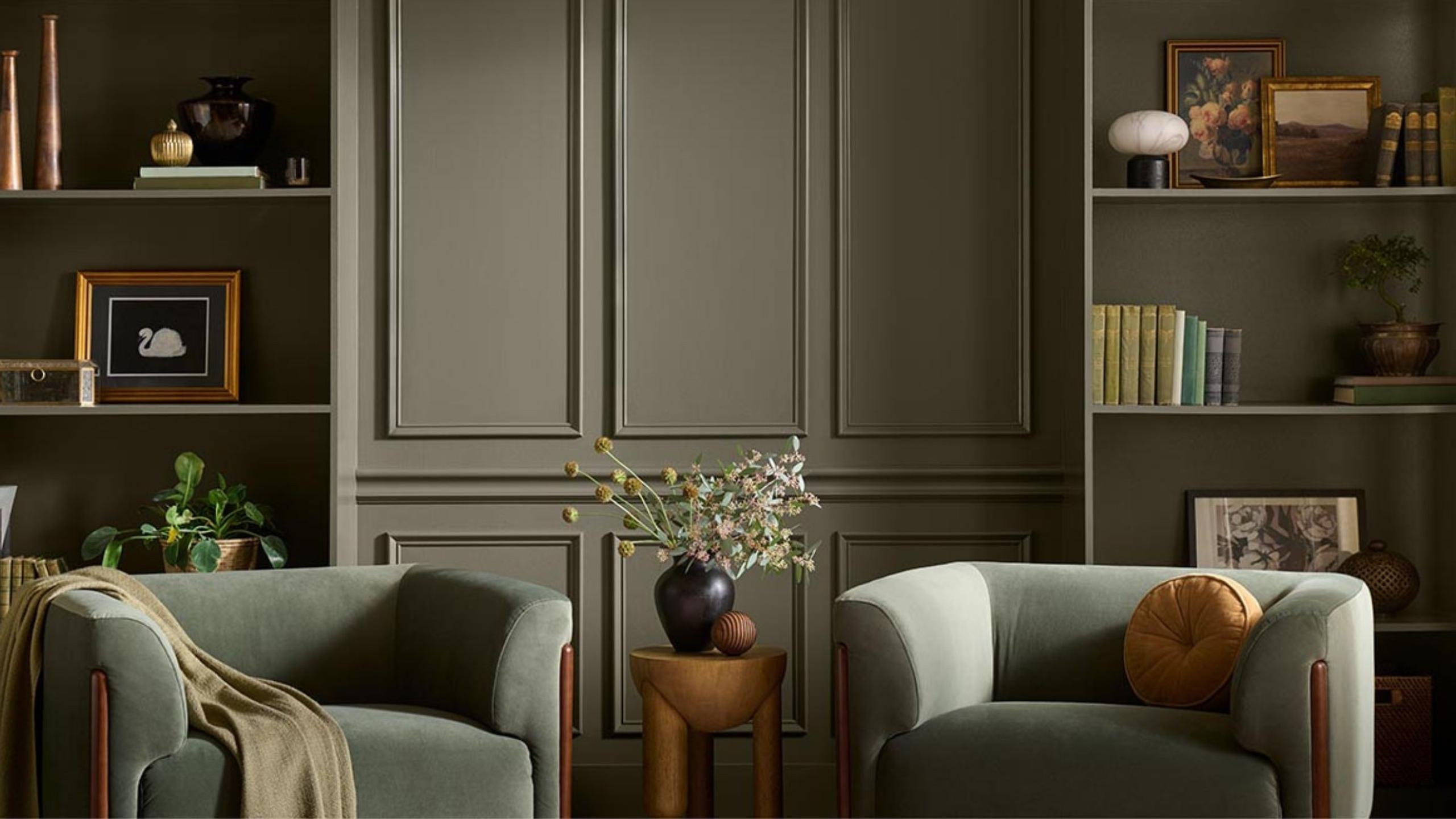
The room I would point to is Yarlington Lodge at The Newt in Somerset, three 19th-century buildings restored by Richard Parr Associates, with classical paintings hung in a green-hued library. That is where an olive belongs: with books, old pictures and somebody's reading lamp.
Webster Green, HC-130, comes from Benjamin Moore's historical collection. Wallpaper* placed it "somewhere between a vibrant emerald and a rich evergreen", Galerie called it a smoky jade, and Benjamin Moore suggests a study, kitchen cabinetry or a front door. Andrea Magno, the company's vice president of brand and colour, said green "consistently demonstrated remarkable staying power".
Of the four greens, it is the only one with nerve.
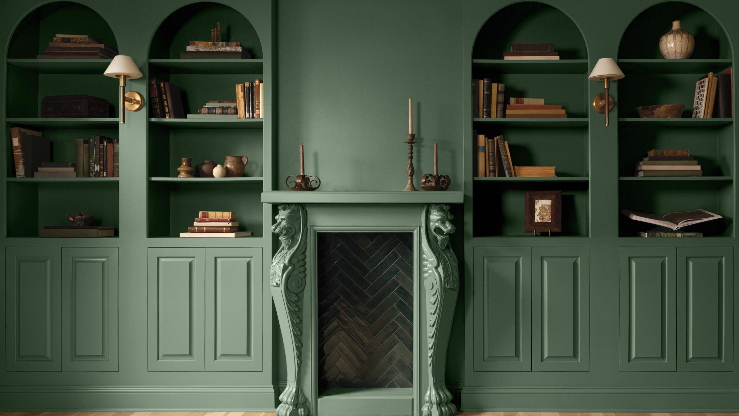
In hospitality it is already in use under another name. At Mandarin Oriental The Landmark in Hong Kong, Joyce Wang Studio wrapped the bar front in fluted jade-toned tiles and set it against patinated brass, verdigris and bronze panels. Webster Green fails when it is rolled across a whole open-plan floor, or laid next to cool grey stone, where it starts to look municipal.
Three blues, and only one is paint
Luminous Blue is not a paint at all. WGSN and Coloro named it, Coloro code 125-28-38, on 29 April 2025, mainly for fashion and product. WGSN compares it to lapis lazuli, "the basis of a vibrant blue pigment used for centuries," and its advice for interiors is to "take inspiration from the hues' traditional and crafted quality." In my first issue I wrote that it interested me more than Pantone's white. It still does, just not on a wall at home.

Stockholm already has the definitive Luminous Blue room. The Blue Line platform at T-Centralen opened on 31 August 1975, and Per Olov Ultvedt painted it with blue leaf tendrils, flowers and silhouettes of the construction workers who built it. A cave, artificial light, and around 39,800 people boarding the Blue Line there on a weekday in 2019. That is where a blue this saturated works. In a rental bedroom it is exhausting.
Valspar's Cottage Door, 8004-38E, announced in early August, is "a reflective, midtone neutral blue that combines warm and cool undertones." Glidden's Artifact, PPG10-16, announced on 14 September and shared with Pittsburgh Paints, is a warm, smoky blue. Glidden's Ashley McCollum calls it "that perfect 'hit reset' color" and "a fresh realignment."
Both are greys that have been allowed a little colour. They are good on a front door or in a bedroom, and weak anywhere that needs to be remembered. On an overcast Stockholm afternoon, a blue-grey is grey.
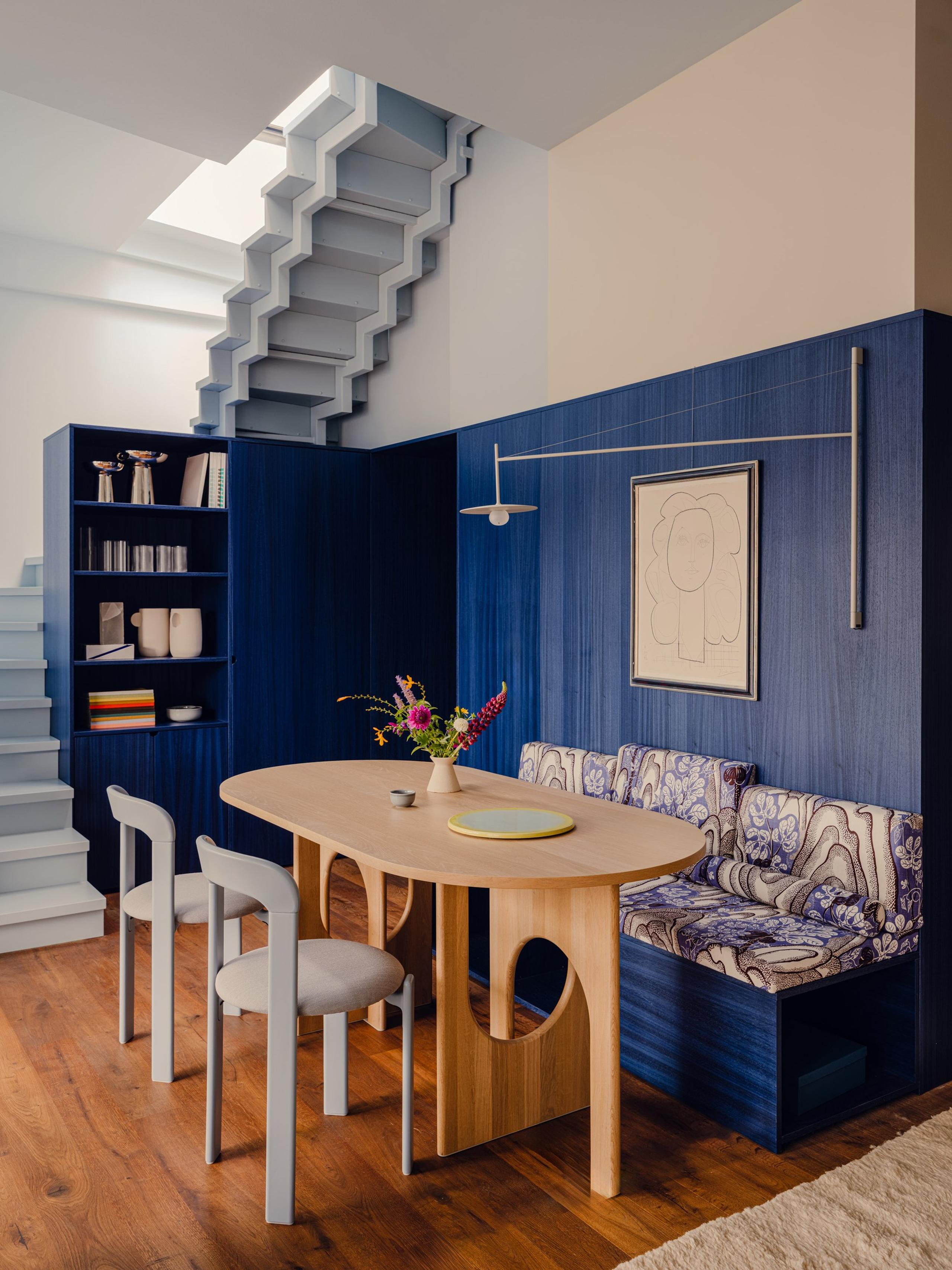
Blue works when it goes into wood. In a 75-square-metre penthouse in Prenzlauer Berg, Bruzkus Greenberg built a dark blue core of stained timber that holds the entrance and a built-in banquette, then painted the staircase and sloping ceiling a lighter sky blue. Stained rather than painted, so the grain survives.
Pink clay, a Finnish taupe and the houses that hedged
Graham & Brown's Rose Earth is "a warm, grounded pink with soft clay and muted brown undertones", inspired by mineral pigments from clay deposits in Italy. The brand says it reads dusty rose in bright light and turns to "warmer taupe and terracotta notes" as the light settles. It is a fitting-room colour. Skin looks good against it.
Retail already knows this. Rafael de Cárdenas's Skims flagship on Regent Street, open since August, runs on cream and beige, with a smooth pink pouffe in the mirrored changing rooms. Rose Earth fails beside cool white kitchen units, where it looks like fresh plaster waiting for its paint.
Tikkurila, the Finnish brand owned by PPG, chose Heartland, S483, a warm mix of beige, taupe and grey drawn from clay, earth and natural stone, with low light reflectance. Murator, which reported it on 29 September, suggests it for around 60 percent of a room's scheme, and on the ceiling too for a fully enveloping effect. As far as I can find, no finished interior has been photographed in it yet.
The other Nordic houses hedged. Jotun did not pick one colour. It launched Journeys, 24 shades in three palettes for its centenary, including Biri, a 1960s green pulled from its archive. Nordsjö took the AkzoNobel sage. Further down the American list, Dunn-Edwards picked a brown too, called French Press Coffee.
What to ask before the lobby goes green
For anyone commissioning a hotel, restaurant or office next year, the useful questions have little to do with trends. Paint a metre square on the actual wall and look at it at four in the afternoon in November. Ask for the light reflectance value. Ask what it does under the fittings you have specified, at 2700 or 4000 kelvin.
Then ask which surface carries it. A green that fails as a wall can be very good as tile, lacquered joinery or upholstery. And ask what it looks like after a year of suitcases and cleaning trolleys. Pale colours show every knock. Mid-tones forgive them.
A calm colour is easy to choose. A colour that stays calm at four o'clock in November is harder.
My verdict is brown
The colour of the year 2027 that matters is Little Greene's Marle, announced in early October. It is a mid-tone brown, so it works on walls and on joinery, hides wear in a busy room, and sits with oak, leather, stone and brass. It is also the colour every green on this list needs beside it.
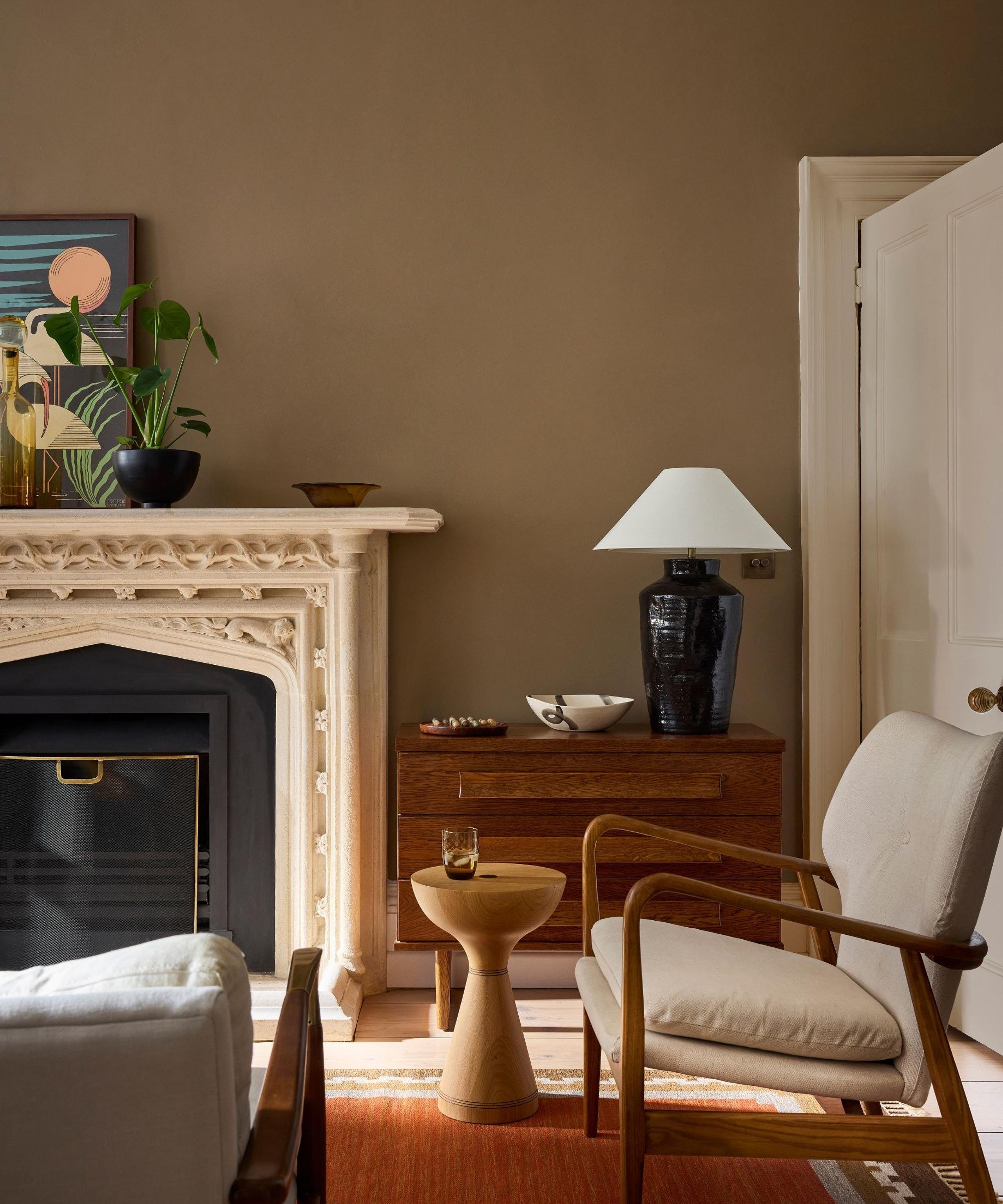
Ruth Mottershead, Little Greene's creative director, told Homes & Gardens that colours this year are becoming "neither too cool nor too warm," and that if they sat on the pH scale, "they would sit at 5 or 6."
Read her recipe for Marle, though. Yellow ochre, plenty of black, and "a touch of red oxide to offset the greening of these two pigments." Even the brown had to be talked out of green this year.
Written by

Poppy Leverentz
Head of Industry Engagement & Insights, Yntra Studio
Poppy tracks the rooms, studios and openings shaping interiors and architecture, from Stockholm outward. Field notes every week.
Sources
- 1Dezeen, Tom Ravenscroft, "Sage green is the Dulux Colour of the Year 2027", 8 September 2026. dezeen.com/2026/09/08/sage-green-colour-year-2027-dulux/
- 2AkzoNobel, "AkzoNobel's 2027 Color of the Year invites you to live lightly", media release, 8 September 2026. akzonobel.com/en/media/media-releases/akzonobels-2027-color-of-the-year-invites-you-to-live-lightly
- 3Nordsjö via Mynewsdesk, "Nordsjös Årets farge 2027 gir en følelse av letthet!", 10 September 2026. mynewsdesk.com/no/nordsjoe/pressreleases/nordsjoes-aarets-farge-2027-gir-en-foelelse-av-letthet-3466546
- 4Benjamin Moore, "Benjamin Moore Names Webster Green HC-130 Colour of the Year 2027", press release, 14 October 2026. benjaminmoore.com/en-ca/press/benjamin-moore-announces-colour-of-the-year-2027
- 5Wallpaper*, "Benjamin Moore's 2027 Colour of the Year is bursting with 'optimistic energy'", October 2026. wallpaper.com/design-interiors/interior-design/benjamin-moore-color-of-the-year-2027
- 6Galerie, "Benjamin Moore Announces 2027 Color of the Year", October 2026. galeriemagazine.com/?p=261688
- 7Complex, Maggie Ekberg, "Celery Just Became a 'Color of the Year' for 2027", 20 September 2026. complex.com/life/a/maggie-ekberg/celery-2027-color-of-the-year
- 8Sherwin-Williams, "Freshness, Balance & Belonging: Our 2027 Color of the Year", undated. sherwin-williams.com/architects-specifiers-designers/inspiration/stir/freshness-balance-and-belonging-our-2027-color-of-the-year/
- 9Sherwin-Williams, "Color of the Year 2027", undated. sherwin-williams.com/en-us/color/color-of-the-year/2027
- 10Dezeen, "I IN clads Human Made store in handcrafted Korean celadon tiles with 'powerful presence'", 9 August 2026. dezeen.com/2026/08/09/i-in-human-made-store-korean-celadon-tiles/
- 11The Nordroom, "Behr Names Grounded Its 2027 Color of the Year", 27 August 2026. thenordroom.com/?p=83320
- 12Behr Canada, "2027 Colour of the Year", undated. behr.ca/consumer/inspiration/2027-color-of-the-year
- 13Homes & Gardens, "Neutrals May Be Easy to Live With, but Behr's 2027 Color of the Year Proves 'Calm No Longer Has to Mean Colorless'", 4 September 2026. homesandgardens.com/decor/paint/behr-color-of-the-year-2027
- 14Dezeen, "Yarlington Lodge at The Newt in Somerset blends 'little snippets of history with life today'", 24 August 2026. dezeen.com/2026/08/24/yarlington-lodge-newt-somerset-richard-parr/
- 15Dezeen, "Joyce Wang draws on 'colonial country manors' for Hong Kong hotel interior", 4 August 2026. dezeen.com/2026/08/04/joyce-wangs-mandarin-oriental-the-landmark-hong-kong/
- 16WGSN, "WGSN and Coloro reveal Colour of the Year 2027, Luminous Blue, and the S/S 27 Key Colours", press release, 29 April 2025. wgsn.com/en/wgsn/press/press-releases/wgsn-and-coloro-reveal-colour-year-2027-luminous-blue-and-s/s-27-key
- 17WGSN, "Colour of the Year 2027: Luminous Blue", blog, 2 June 2025. wgsn.com/en/blogs/colour-year-2027-luminous-blue
- 18Wikipedia, "T-Centralen metro station". en.wikipedia.org/wiki/T-Centralen_metro_station
- 19Wikipedia (Swedish), "T-Centralen". sv.wikipedia.org/wiki/T-Centralen
- 20Valspar, "Color of the Year 2027: Cottage Door", undated. valspar.com/en/colors/color-of-the-year-2027
- 21PCI Magazine, "Valspar Names its 2027 Color of the Year", 9 August 2026. pcimag.com/articles/115015-valspar-names-its-2027-color-of-the-year
- 22Glidden via Bastille Post (Business Wire), "GLIDDEN Paint Takes on Blue, Naming Artifact the 2027 Color of the Year", 14 September 2026. bastillepost.com/global/article/6155308-glidden-paint-takes-on-blue-naming-artifact-the-2027-color-of-the-year
- 23Dezeen, "Bruzkus Greenberg arranges compact apartment around multifunctional 'blue box'", 26 April 2026. dezeen.com/2026/04/26/bruzkus-greenberg-multifunctional-blue-box-berlin-apartment/
- 24Graham & Brown, "Rose Earth Paint", product page, undated. grahambrown.com/ie/product/rose-earth-paint/147315-master/
- 25Dezeen, "Kim Kardashian unveils nude-hued Skims London flagship store", 11 August 2026. dezeen.com/2026/08/11/kim-kardashian-nude-hued-skims-london-flagship-store/
- 26Murator Dom, Adriana Słowik, "Kolor Roku Tikkurila 2027 już wybrany. Heartland to ciepły odcień ziemi, który ma uspokajać wnętrza", 29 September 2026. muratordom.pl/wnetrza/salon/kolor-roku-tikkurila-2027-juz-wybrany-heartland-to-cieply-odcien-ziemi-ktory-ma-uspokajac-wnetrza-ak-3x1m-A1S1-4NZF.html
- 27Jotun, "Journeys: Jotun Colour Collection 2027" (title dash replaced with colon), undated. jotun.com/me-en/decorative/inspiration/articles/indoor/how-to-combine-paint-colours
- 28The Nordroom, "Jotun Launches JOURNEYS: A New Color Collection for 2027", 25 August 2026. thenordroom.com/?p=83157
- 29Homes & Gardens, Eleanor Richardson, "Forget Everything You Know About 1970s Brown: Little Greene's Color of the Year 2027 Is a Gentle, Whisper-Soft Brown That's 'Quietly Confident'" (title dash replaced with colon), 7 October 2026. homesandgardens.com/decor/paint/little-greene-color-of-the-year-2027
- 30Colorcombinations.org, "Color of the Year 2027: All 14 Picks So Far, Side by Side". colorcombinations.org/trends/color-trends-2027/
- 31NBC Connecticut, "Pantone Color of the Year 2026", 4 December 2025. nbcconnecticut.com/news/national-international/pantone-color-of-the-year-2026/3671304/
Image credits
- 1Courtesy of Nordsjö / AkzoNobel. Source: mynewsdesk.com/no/nordsjoe/pressreleases/nordsjoes-aarets-farge-2027-gir-en-foelelse-av-letthet-3466546
- 2Courtesy of Sherwin-Williams. Source: sherwin-williams.com/en-us/color/color-of-the-year/2027
- 3Courtesy of Behr, via Homes & Gardens. Source: homesandgardens.com/decor/paint/behr-color-of-the-year-2027
- 4Courtesy of Benjamin Moore, via Homes & Gardens. Source: homesandgardens.com/decor/paint/benjamin-moore-color-of-the-year-2027
- 5Photo: Arild Vågen / Wikimedia Commons. CC BY-SA 4.0, resized. Source: commons.wikimedia.org/wiki/File:T_Centralen_January_2015.jpg
- 6Photo: Pion Studio / Courtesy of Bruzkus Greenberg, via Dezeen. Source: dezeen.com/2026/04/26/bruzkus-greenberg-multifunctional-blue-box-berlin-apartment/
- 7Courtesy of Little Greene, via Homes & Gardens. Source: homesandgardens.com/decor/paint/little-greene-color-of-the-year-2027